
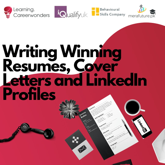
A resume, also commonly referred to as a CV, is a document that an individual organizes to present their skills, personality, experience, and background to name a few of the many things mentioned. With a lot more kids doing internships or applying for part-time jobs it is essential that you are aware of how to present a neat and acceptable resume. Though it may seem like a meticulous detail, it does change the entire way your resume is presented. Your resume is the most important part while applying somewhere, it is the first glimpse your interviewer gets of you and your skills. Think of it like a first impression. It communicates to your interviewer whether you are really the right fit for the job or not.
Moving on, this brings me to a question that is obviously and rightly so raised. What’s the big deal about the font on a resume? Sure, you have all your qualitative information down then what’s the point? Right? Wrong. Think of it like this, remember how your teachers would always tell you to make sure your handwriting is neat when you attempt your exam? It’s the same thing. Instead of focusing on what you’ve written, the interviewer will most likely be hung up on the font. Not using the correct font can make your resume look messy, unorganized, and distracting. It is also most likely to reflect your personality to the interviewer if you don’t care about your resume not being presentable then how does the interviewer have any guarantee you are to carry out detailed tasks with care and focus? Though this may not be true for all jobs, either way, better safe than sorry.
BEST FONTS
Interviewers want something that looks professional and clean. A font that is designed to perform well and be read easily no matter the font size. It is important that your CV is aesthetically pleasing to look at so that the reader wants to read ahead and focuses on what is written. A go-to option includes the Microsoft default font, Calibri. It is simple, clean, and gives a seamless look. On the other hand, if you’re looking for something to make the text look readable while being sized down, Cambria or Georgia may be your option. For bolder titles that you want to stand out and catch the reader’s eye, use something like Helvetica that gives a sophisticated feel without hurting your eyes to look at.
WORST FONTS
Just like there are fonts interviewers prefer, the same way there are some fonts you should straight up avoid when writing up your CV. If you are even considering using Comic Sans for your CV please step away from the keyboard. Comic Sans was originally designed to look like speech bubble characters and give a childish look. Using this automatically makes your CV look unprofessional off the bat. Other than this fonts like Courier, Futura, and Times New Roman are also to be avoided. It is better you steer clear of eccentric fonts and stick to the defaults and go-to’s. Maybe being different can be bad sometimes!
Are you interested in improving your resume? Take our course today.


